Almond Breeze
From bland to hip
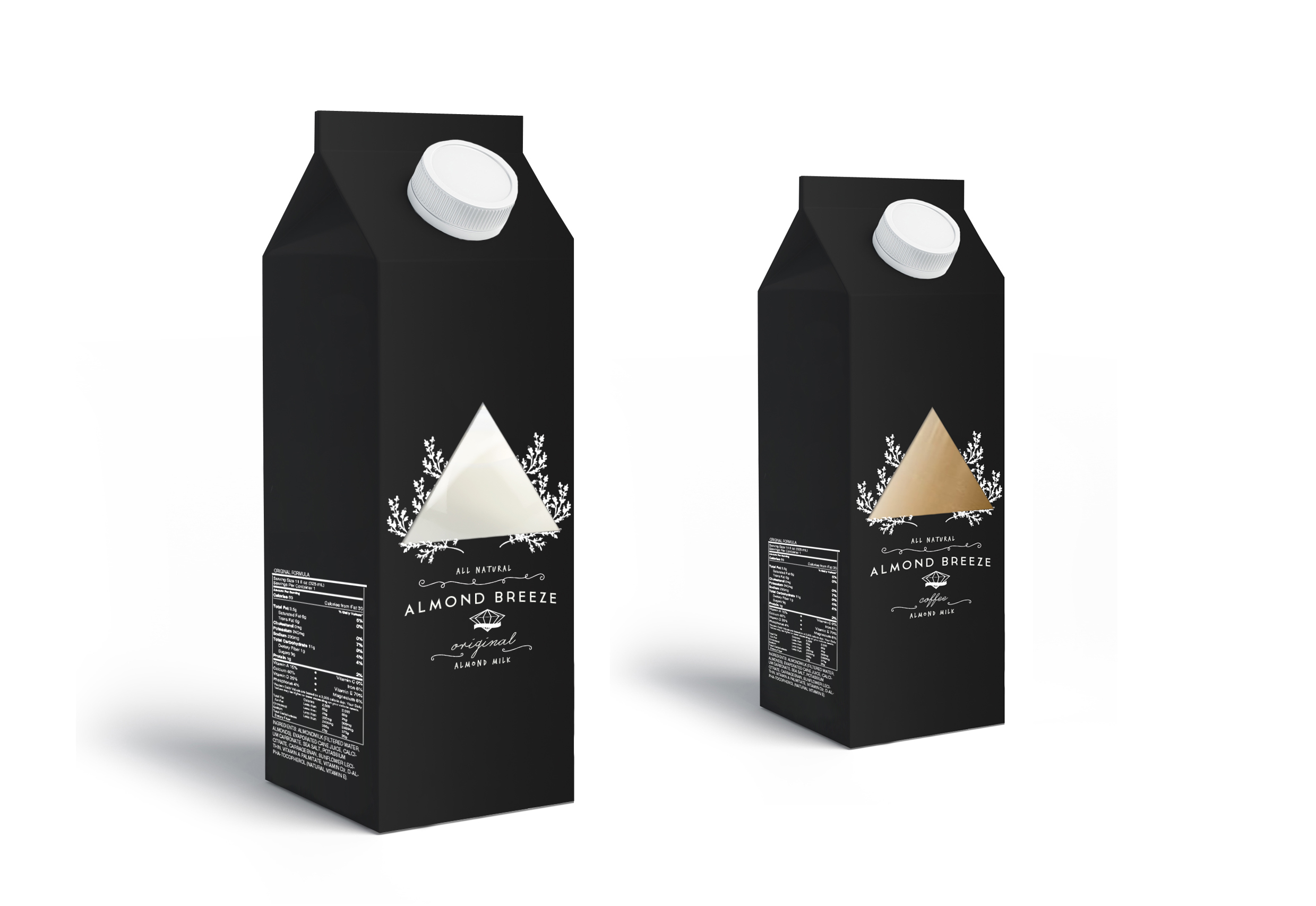
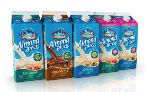
I had to select a product whose packaging design I wanted to redesign. I chose Almond Breeze, as I felt that the design was bland and blends in with other milk products.
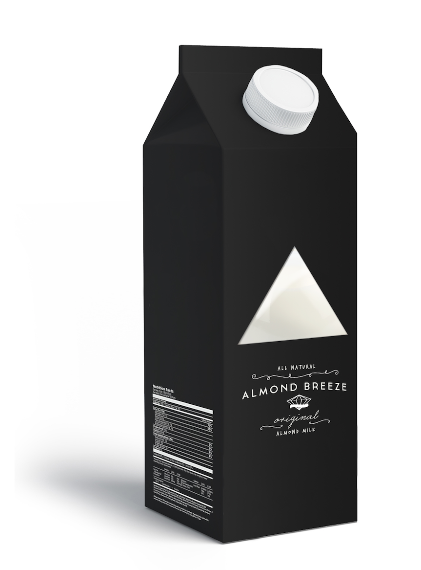
I kept Almond Breeze's diamond symbol, but made the packaging more elegant, or what could be considered "hipster". I wanted to bring about a classy feel for the brand, as it promotes home recipes that the product can be used in. Many people like to post pictures on their social media, and a cute packaging design would make the photo cut.